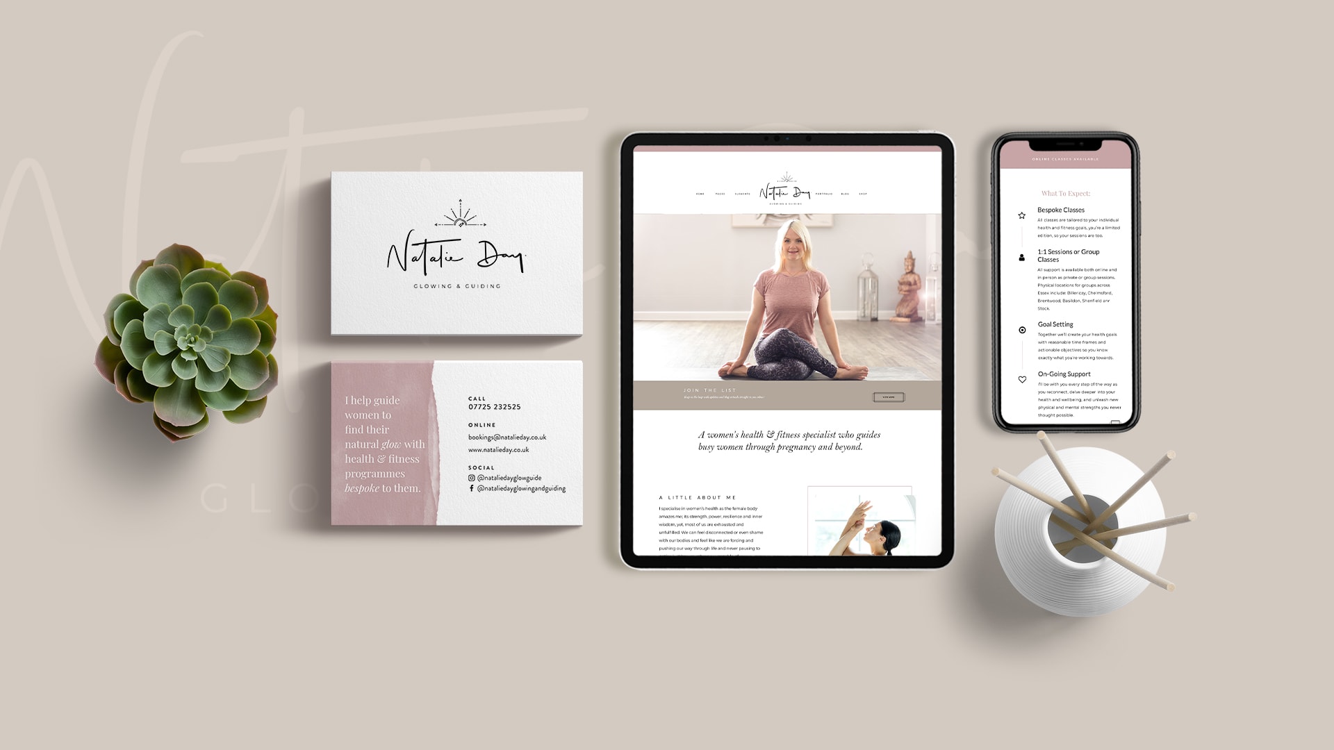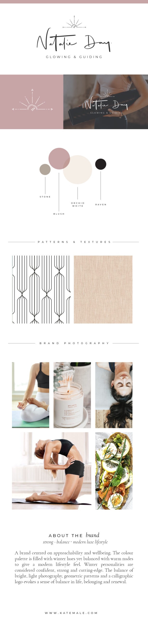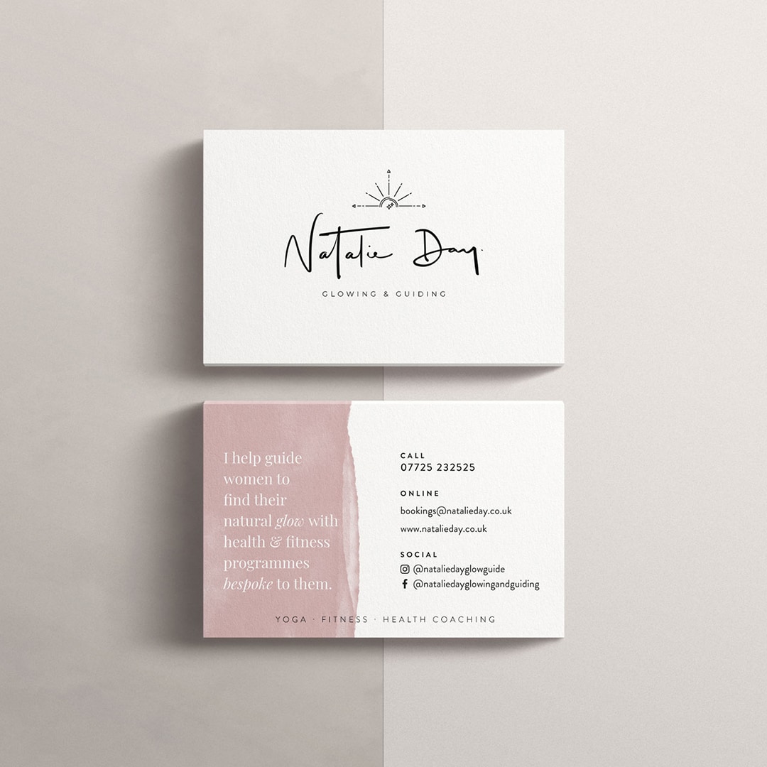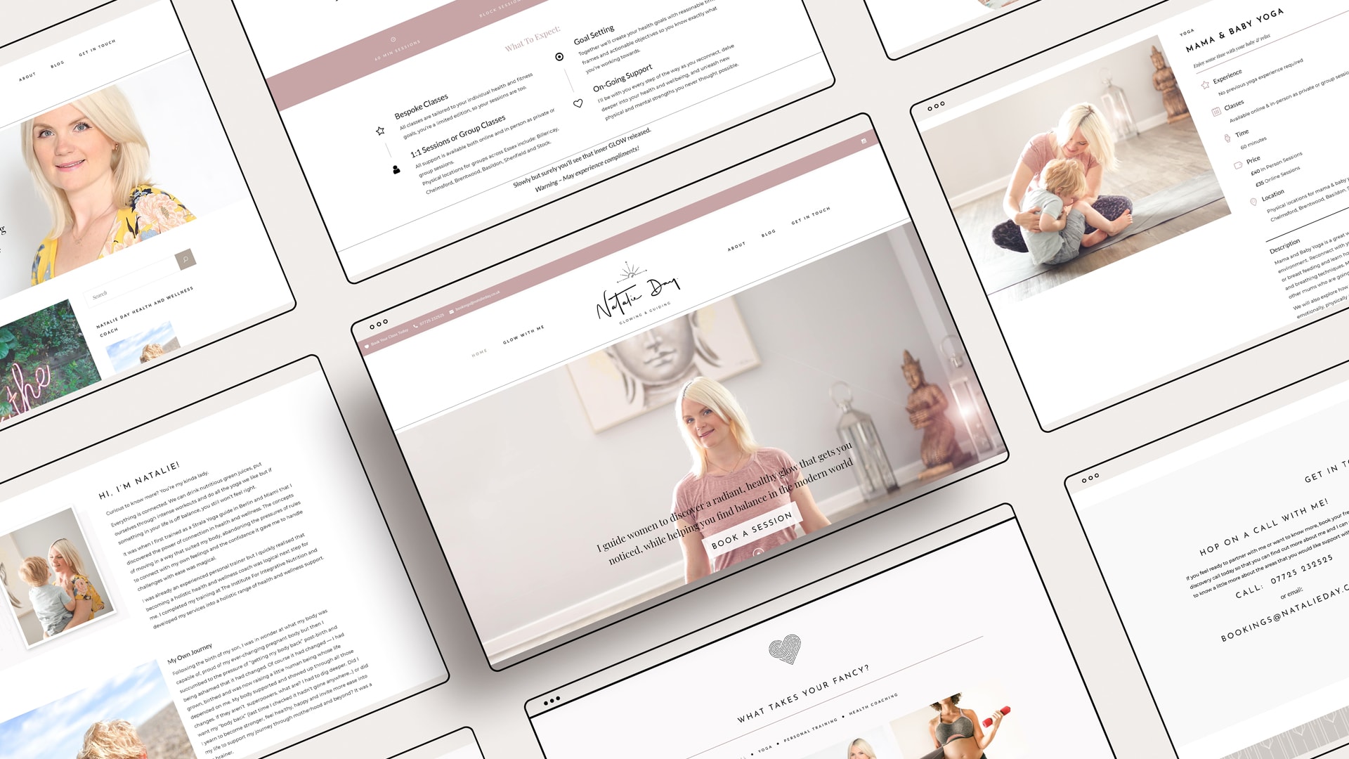
I drew inspiration from Natalie’s warm and calm persona to truly connect to her dream audience (established during the brand strategy meeting). I wanted to create something fresh, modern, and high-end, so a hand-scripted logo, with warm tones running through glowy brand photography felt perfect. Since Natalie is all about glowing and guiding, the submark incorporates the glow of the sun depicted as a compass that guides. The pattern conveys the brand’s modern luxury style, as well as her love for geometric patterns. The Colour palette is filled with winter hues balanced with nudes to give a modern luxe feel. The overall balance of the bright, light brand photography, geometric patterns, and hand lettered logo evokes a sense of balance in life, belonging, and renewal.