
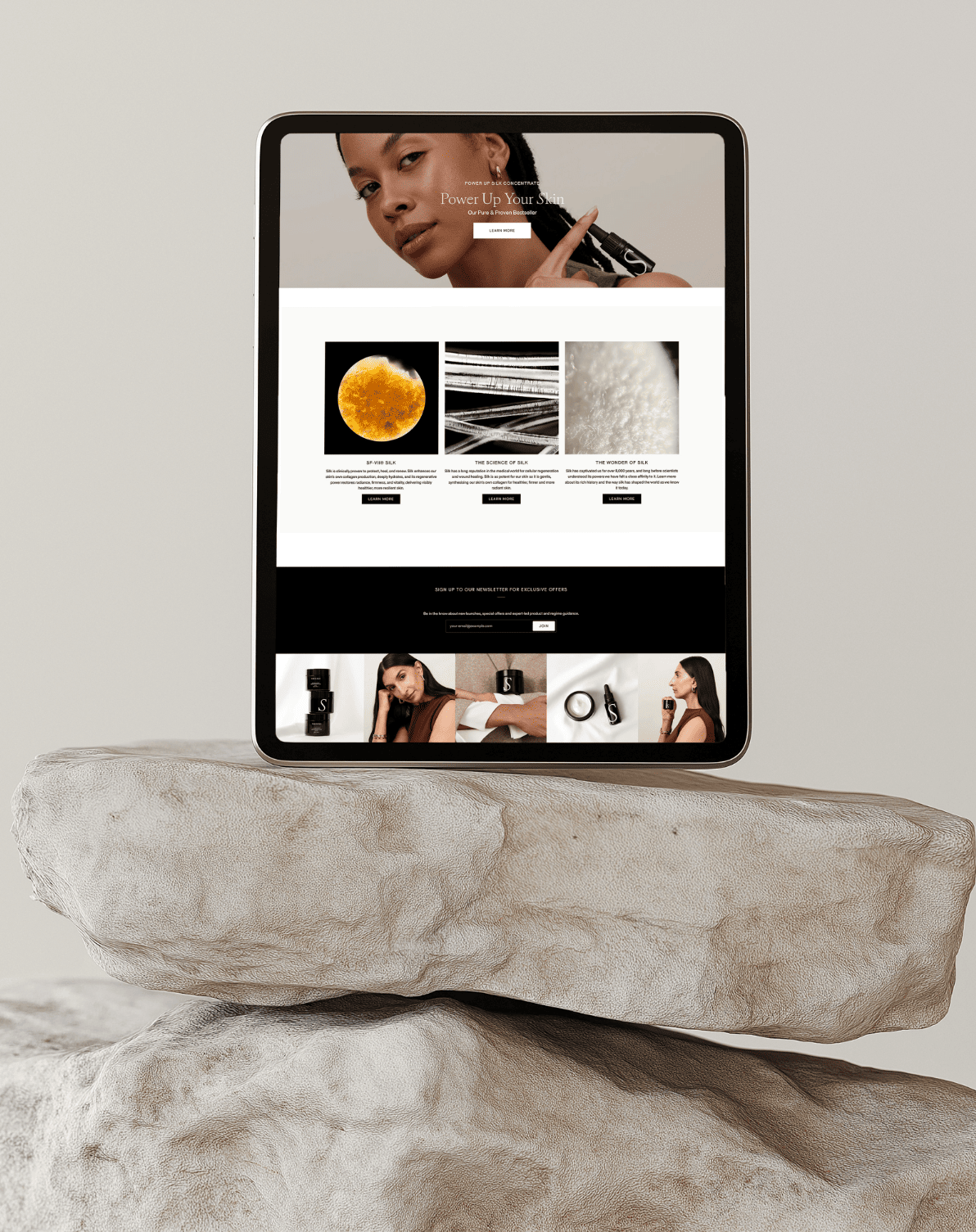


Website design
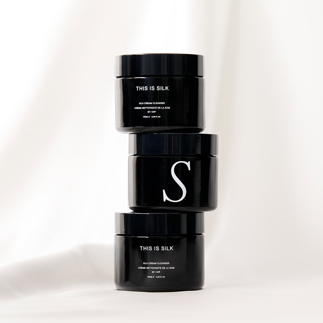
Packaging design
Creative direction
Where scientific substance meets sensory luxury.
To position the brand as a science-led, design-consious, editorial beauty world. A brand experience that invites people to look closer, understand more and develop a stronger connection with THIS IS SILK. With a skincare proposition centred on the science of SF-VII silk peptide, the brand has a deeper story to tell: one of research, evidence and a founder’s determination to understand what silk could offer the skin. The brand needed to build that understanding while preserving the emotional appeal of its products. Technical information needed context; evidence needed a clear hierarchy, and every element had to help people understand what made THIS IS SILK distinctive and why it deserved their attention.
The opportunity was to make that depth accessible across multiple touchpoints, giving the science a clear voice within the brand’s experience that felt refined, tactile and desirable.
“Kate has completely delivered on her expertise for This Is Silk. I actually get quite emotional looking at the beautiful work Kate has created. She truly has an eye for design. The packaging is stunning, and our customers have been raving about the sleek new website. It’s everything we envisioned and more.” SONAL KEAY – FOUNDER OF THIS IS SILK

It’s on the way to you.
Be sure to check you inbox for your link to your download. I hope you find it as helpful as the many others before you!
– Kate
Myself or someone from my team will be in touch shortly to respond to your enquiry.
I look forward to connecting with you.
Warmest, Kate