And how to fix them
There is a growing narrative in design circles that “beige is boring” that neutral, restrained brands lack imagination, personality, or edge.
But beige is not the problem.
Flatness is.
What people are reacting to is not restraint. It is brands using a simplified palette as a substitute for strategic thought, then calling it “minimal luxury”.
Because a luxury brand does not become desirable through colour alone.
It becomes desirable through atmosphere.
Through hierarchy.
Through language.
Through imagery.
Through rhythm.
Through restraint.
Through the feeling it leaves behind.
A considered, simplified palette does not remove depth, style, or story. It creates space for them.
Typography carries more weight.
Imagery feels more intentional.
Language becomes more precise.
The brand experience has room to breathe.
This is what refined brands understand.
They are not competing for attention at every touchpoint. They are building cohesion, clarity, and emotional gravity.
Simplicity is not the absence of creativity. It is the result of discipline, taste, and strategic intent.
And when it is done well, it never feels boring.
It feels considered.
The real reason “minimal” brands look basic is not because they have removed too much. It is because they have failed to replace surface detail with structure, atmosphere, and meaning.
A strong brand can still hold presence when you strip it back.
That is the test.
These are the 8 blind spots that quietly make a luxury brand look basic — and how to fix them.
1. Treating Colour as the Only Brand Asset
A simple palette is not the absence of personality. But when colour is the only memorable thing about a brand, the identity has no real architecture.
This is where many “minimal luxury” brands collapse. They strip everything back, but fail to build distinction elsewhere.
No recognisable type system.
No photographic language.
No tonal rhythm.
No sensory world.
No clear point of view.
It is amateur to think colour is the only way to create recognition. In fact, a restrained palette often allows more room for detail, texture, composition, and language to do their work without every element competing for attention.
This is what luxury brands tend to understand.
They do not rely on one visual cue. They build a full world.
How to fix it:
Use colour as support, not the whole story. Build character through typography, art direction, layout, materiality, copy, digital pacing, and tone of voice. Your colour palette should support the brand world, not carry the entire weight of it.
2. Inconsistent Brand Photography
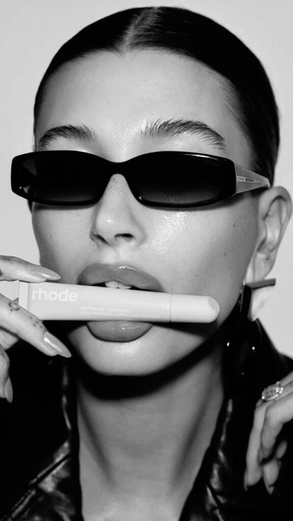
Your brand imagery either feels like it has been pulled from different worlds, or it looks so predictable that it disappears into everyone else’s.
Both are a problem.
Inconsistent photography weakens trust because it makes the brand feel assembled rather than directed. Generic photography weakens desire because it gives the audience nothing specific to remember.
Luxury does not rely on pretty images.
It relies on visual control.
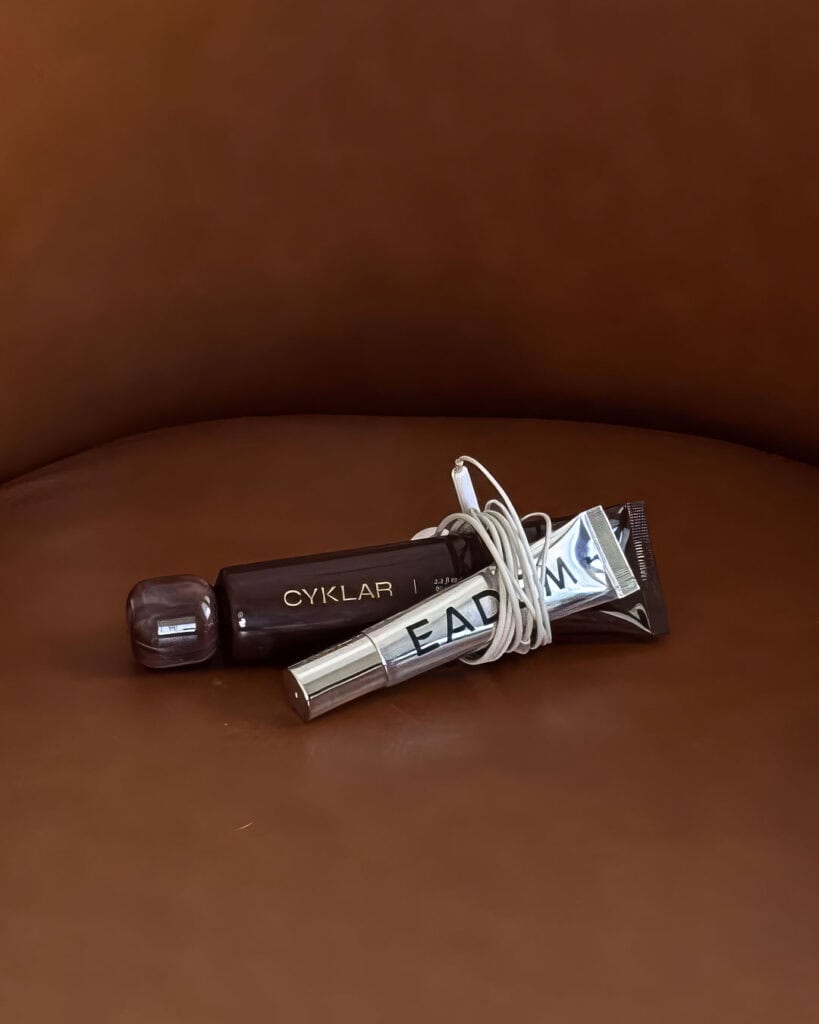
The lighting, composition, texture, crop, subject matter, tonal range, and negative space all need to feel like they belong to the same emotional world.
A beauty brand should not use one image that feels clinical, another that feels bohemian, another that feels corporate, and another that feels like a stock photo for “wellness”. That is not range. That is confusion.
How to fix it:
Define a clear photographic language. Decide what the brand’s imagery should feel like before choosing what it should show. Consider lighting, shadow, texture, skin tone, product styling, environment, gesture, movement, and pace. Luxury branding is a world, not a collage.
3. Fonts That Do Not Carry Their Weight
Choosing a “luxury” font does not create a luxury brand.
It only reveals whether the strategy beneath it is strong enough to hold the weight.
A dramatic serif font, elegant script, or high-contrast typeface can look beautiful, but if it is used without discipline, it quickly becomes decorative. Worse, it can make the brand look like it is performing luxury rather than embodying it.
Typography is not just about choosing a font.
It is about hierarchy, spacing, proportion, rhythm, readability, confidence, and restraint.
The most refined brands understand that type behaves like architecture. It creates structure. It guides the eye. It sets the pace. It tells the audience what matters.
A font alone cannot do that work.
How to fix it:
Treat typography like a system, not an accessory. Build a clear hierarchy across headings, subheadings, body copy, calls to action, captions, packaging, and digital touchpoints. Pay attention to spacing, scale, line length, and balance. The way type is used is a signal, not a sign.
4. Flat Design Disguised as Simplicity
Simplicity without depth feels empty.
This is one of the most common blind spots in modern luxury branding. A brand removes colour, detail, ornament, and expression, but does not replace them with anything meaningful.
The result is not refined.
It is flat.
There is a difference between a brand that feels intentionally restrained and one that feels unfinished. The former has tension, atmosphere, and control. The latter simply has less on the page.
Minimalism is not just a design style. It is a discipline.
It requires contrast, rhythm, proportion, texture, language, and emotional precision. Without those things, simplicity becomes silence.
Not the powerful kind.
The forgettable kind.
How to fix it:
Layer depth through texture, contrast, story, art direction, and sensory cues. Think about how the brand should feel beyond the screen: warm, cool, tactile, airy, grounded, polished, intimate, serene, sensual, precise. Minimalism is a mood as much as it is a visual choice.
5. Performing Luxury Instead of Practising it
Luxury is not a font, a muted palette, a foil detail, a serif logo, or a softly lit campaign image.
Those are visual cues.
They only work when the thinking beneath them is disciplined.
A brand performs luxury when it borrows the surface codes but lacks the operational standards. The website feels vague. The messaging is generic. The client experience is inconsistent. The pricing lacks confidence. The imagery feels detached from the offer. The copy sounds expensive but says very little.
That is not luxury.
That is theatre.
True luxury is not built through aesthetic mimicry. It is built through aligned decisions.
The brand knows what it stands for.
The offer is clear.
The experience is considered.
The visuals are controlled.
The language has weight.
The details are not accidental.
Luxury does not need to announce itself when the system is working.
How to fix it:
Stop borrowing restraint and start building it. Align positioning, pricing, messaging, visuals, website structure, client experience, and delivery. Luxury is not a moodboard. It is the accumulation of considered decisions.
6. No Brand World
When your brand exists only as a collection of assets, it lacks gravity.
You may have a beautiful logo, a tasteful palette, an elegant font, and a few polished mockups. But if those elements do not create a recognisable world, the brand will still feel thin.
This often shows up as a beautiful logo sitting beside generic stock imagery. Or Instagram posts that feel unrelated to the website. Or a service page that does not share the same atmosphere as the portfolio. Or copy that sounds like it belongs to a completely different business.
A brand world is what makes the identity feel lived-in.
It gives people somewhere to enter.
Luxury brands do not simply show you what they sell. They create a sense of place, pace, mood, and belonging. You understand the world before you are asked to buy from it.
That is why the best brands feel memorable before they are fully explained.
How to fix it:
Design the full world: visual language, tone of voice, imagery, layout, rhythm, experience, materiality, and brand ambience. Ask what the brand should feel like across every touchpoint — website, social media, packaging, emails, proposals, photography, client journey, and aftercare. The brand should feel lived-in, not assembled.
7. Empty Space Dressed Up as Minimalism
Whitespace is not empty space.
It is a tool for hierarchy, rhythm, and restraint.
Used well, it creates calm. It gives important details room to breathe. It allows the audience to move through the brand with ease. It signals confidence because the brand is not trying to fill every inch of attention.
Used badly, it feels bare.
This is where many stripped-back brands go wrong. They mistake emptiness for elegance. They create layouts with plenty of space, but no tension, balance, or purpose.
The result feels unfinished rather than refined.
Luxury design does not simply use space.
It controls it.
How to fix it:
Use negative space strategically. Space should create hierarchy, not absence. It should guide the eye, frame the message, and create a sense of calm authority. Edit until the touchpoint feels balanced, composed, and intentional, not sparse for the sake of it.
8. Designing For the Eye, Not the Senses
When branding stops at visuals, it loses its atmosphere.
A brand can look polished and still fail to hold attention. It can be aesthetically pleasing and emotionally forgettable. It can be beautifully designed and still leave no real imprint.
This happens when the brand has been designed for the eye, but not the senses.
Luxury branding should be felt as much as seen.
A spa brand should not only look clean. It should suggest temperature, scent, texture, pace, touch, silence, and ritual.
A beauty brand should not only look elegant. It should evoke skin, light, intimacy, confidence, transformation, and care.
A lifestyle brand should not only look aspirational. It should create a feeling of pace, desire, ease, and belonging.
The aim is not just to create something attractive.
The aim is to create an atmosphere people want to stay inside.
How to fix it:
Design with sensory intention. Use visual cues to trigger an emotional and physical response. Consider texture, light, pacing, language, sound, materiality, movement, and mood. A strong brand does not just show people what it is. It makes them feel what it means.
What Luxury Brands Understand That Most Brands Forget
When everything feels overly predictable, nothing is remarkable.
Luxury is not louder.
It is clearer.
It is knowing what to remove and still communicate.
It is trusting the audience.
It is allowing the work to speak without forcing it.
It is having the confidence to go against the grain when everyone else is playing safe.
Safe is forgettable.
Taste is not.
A luxury brand does not need to chase attention when it has presence. It does not need to over-explain when the experience is doing its job. It does not need to decorate every surface when the thinking beneath it is strong.
That is the difference between a brand that looks expensive and a brand that feels valuable.
One borrows the codes.
The other builds the world.
Key Takeaways
Use colour as support, not the whole story.
Build depth through typography, texture, tonal contrast, materiality, sensory cues, photographic language, and consistent art direction.
Cohesion, restraint, confidence, and atmosphere make a brand feel luxurious — not price tags, gold accents, serif fonts, or vague buzzwords.
A brand feels flat when it removes surface detail without replacing it with structure, meaning, or intention.
Minimalism requires discipline. It is not the easiest route. It is often the hardest.
Beige is not boring.
Flat branding is boring.
A neutral palette can be powerful when the brand leans into what matters: story, structure, rhythm, emotion, experience, and a clear point of view.
It is not the death of beige.
Simplicity is a skill. Designers, interior designers, fashion designers, furniture designers, architects, and car designers know this well. The most refined work is often the result of what has been removed, not what has been added.
But removal only works when what remains is strong.
Simplicity is a practice as much as it is a form of taste. When it is done with intention, it does not feel boring.
It feels grounded.
It feels composed.
It feels deeply considered.
A Question to Sit With
If your brand stopped competing for attention, what could it become instead?
And if your brand looks polished but still feels hard to remember, the issue is rarely the colour palette.
It is usually the thinking beneath it.
My Brand Planner & Workbook was created to help you build that foundation: the strategy, story, tone, visuals, and emotional world your brand needs to hold attention with more depth, style, and intention.
Because a luxury brand is not built by looking expensive.
It is built by becoming unmistakable.