British heritage reimagined through contemporary luxury fragrance branding
Belvoir in Bloom is a luxury fragrance brand created by master perfumer Phoebe Manners. KM Creative was responsible for the brand strategy, positioning, world building, visual identity and packaging design.
The challenge was to translate a deeply personal heritage story into a contemporary niche fragrance brand without falling into cliché or over-romanticising British aristocratic imagery.
1. The Brand Strategy
The starting point was not aesthetics, but clarity of value.
Phoebe returned to perfumery after more than 20 years away, crafting fragrances for the likes of Hobbs London, Joanna Lumley, Violet Manners Wedding, Prince Charles and Balmoral Castle. entering a market dominated by highly conceptual niche fragrance brands. While she had deep expertise and provenance, she lacked a clear framework for how to position herself within this new landscape.
The strategic decision was to build the brand around what already existed, rather than inventing a new narrative.
Key strategic foundations:
- Master perfumer expertise as authority
- Belvoir Castle and landscape as origin point
- Personal artistic practice as creative extension
- British seasonal memory as emotional anchor
The brand strategy focused on one core question:
What does this brand already possess that cannot be replicated?
The answer became the foundation of Belvoir in Bloom.
2. Positioning
The fragrance market is saturated with brands referencing heritage, nature and storytelling. The risk for Belvoir in Bloom was becoming visually and conceptually generic within that space.
The positioning therefore avoided literal heritage cues and instead focused on:
- Contemporary British luxury, not historical reproduction
- Personal provenance, not institutional heritage
- Sensory storytelling, not decorative narrative
- Editorial restraint, not ornamental excess
The brand was positioned as a modern niche fragrance house rooted in lived British landscape and memory, rather than aristocratic symbolism.
This allowed Belvoir in Bloom to sit confidently within the niche fragrance category without relying on cliché heritage markers.
3. World Building & Storytelling
The world of Belvoir in Bloom was built around the emotional experience of the English landscape rather than its literal representation.
Instead of recreating a traditional “country estate aesthetic”, the focus was on sensory fragments:
- Morning light across gardens
- Dew on woodland ferns
- Seasonal flowers gathered from the grounds
- Movement through the Belvoir landscape
- Atmospheric shifts across the British seasons
These elements formed a sensory narrative system that could be translated across photography, illustration and digital touchpoints.
Importantly, the world was not designed as a static heritage setting, but as a lived, changing environment shaped by memory and seasonality.
This created a brand universe that feels immersive rather than decorative.

4. Brand Identity
The visual identity was built on a tension between heritage and modernity.
Rather than reproducing traditional British luxury codes, the system was edited and reinterpreted:
- Refined serif typography for heritage grounding
- Oversized editorial typography for modern contrast
- Botanical illustration drawn from Phoebe’s own artwork
- A restrained, muted colour palette inspired by the landscape
- Cropped, contemporary composition styles
A key decision was to integrate Phoebe’s own illustrations into the identity system.
These were not decorative assets, but authored elements — reinforcing authenticity and creative ownership.
The result is a contemporary British luxury identity that balances romance with editorial restraint.
5. Packaging & Unboxing Experience
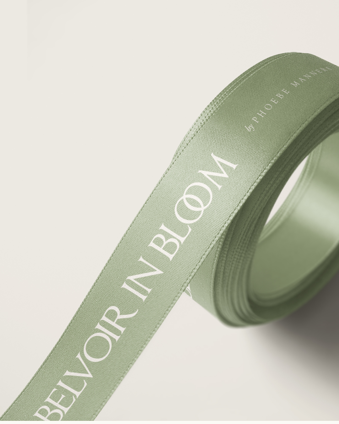
The packaging system was designed to extend the brand world into a physical, tactile experience.
The unboxing journey was considered as part of the storytelling:
- Minimal, refined outer packaging to establish luxury restraint
- Botanical illustration used as a subtle narrative layer
- Typography-led hierarchy to reinforce brand confidence
- Considered material choices to reflect craft and permanence
The experience was designed to feel quietly luxurious rather than performative, allowing the fragrance itself to remain the focal point.
Every touchpoint reinforces the same principle: heritage expressed through restraint, not decoration.
Final Thought
Belvoir in Bloom demonstrates that strong luxury fragrance branding does not come from adding more story, but from clarifying what already has value and expressing it with discipline.
The result is a brand that feels:
- rooted, but not nostalgic
- expressive, but not decorative
- personal, but commercially positioned
- heritage-led, but unmistakably contemporary